

BC Dental Design
A Pittsford, NY dental practice that provides high-quality comprehensive dental care and customer service by always going above and beyond
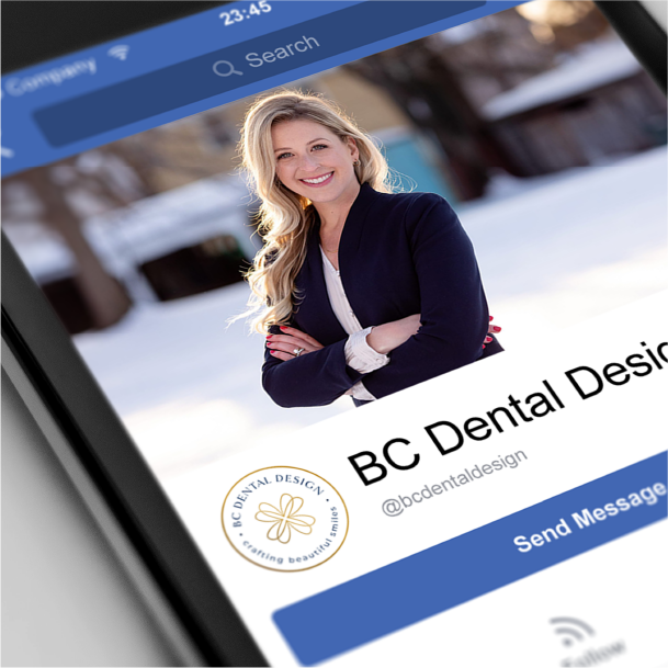
Brittany had recently purchased a dental practice and wanted to give it a refreshing new look. She was looking for something professional but elegant with a spa-like feel. It’s important that her patients feel special, are able to relax, and are comfortable. Some of the words that came to mind through the discovery process were kindness, friendly, confidence, customer service, and grace. The icon is actually a simple illustration of a tooth duplicated four times and rotated to create what looks like a flower. The colors navy and gold give the brand an elegant, expensive feel, while the more friendly teal and mint colors bring that relaxing, calm feeling.
Services: Branding, Business Cards, Appointment Cards


Back to Portfolio
Ready to get started?
This is so exciting! Book your FREE consultation below.